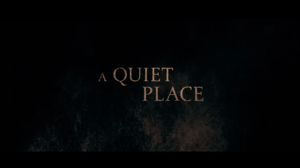
Moving on to titles, in almost all dramatic thrillers the style of the letters are usually in bold or in some cases splashed with blood or faded out. This helps depict the fact that the movie will be a thriller. Some titles also have the letters looking almost distressed to add that messy look to the cover. The size in fonts of the titles varies for thrillers. However, most of the time the letters are big and bold. This creates that ‘in-your-face’ look or making it seem like the letters are popping out at you. In dramatic thriller films, the titles include the name of the movie, the main or famous actors that star in the film, maybe a little saying that can be catchy or spooky, the director, and the date it was released. As for our title, “The Vanished”, Jackie and I chose this because since the assumption will hopefully be made of the toddler getting abducted, we wanted to use the word “vanished”. Our opening scene never shows the audience Sawyer getting abducted but since she disappears along with the man at the same time, our viewers will then infer that she was taken by him.
Opening scene: https://www.youtube.com/watch?v=T_FdjXqSZlc&t=16s

This clip is a screenshot I took from the opening sequence of the film ‘A Quiet Place’. The letters in the title are all a light brown and uppercase, giving a larger and more dramatic look. The color brown is known to give a ‘dirty’ appearance which enhances the thrilling vibe. Also, the letters are distressed which again contributes to the spooky aspect. Many movie titles tend to have capitalized or bold letters to really emphasize the title.